Why everyday meals became a design problem
Our research focused on people gradually reintroducing foods and recording their reactions. Both interviewees described a long history of suffering and not being taken seriously in everyday life. Meals meant planning, explaining their needs and facing misunderstanding. Captis began with a question: how could documenting food and symptoms become less of a burden?
“You’re standing at a party with a rash all over your face.”
“I knew I’d have to order something that would make them look at me strangely and think, ‘What’s her problem?’”
6 survey participants. 2 interviews. One recurring problem.
I conducted interviews and worked on the user research. Across our research and app review, we identified demanding tracking flows and insufficient guidance. All three team members abandoned tracking during our own trial of an existing app. We focused on making daily entries easier, rather than adding more information.
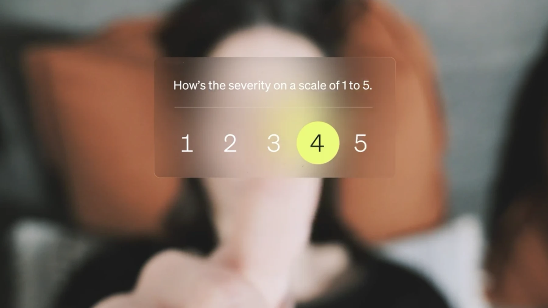
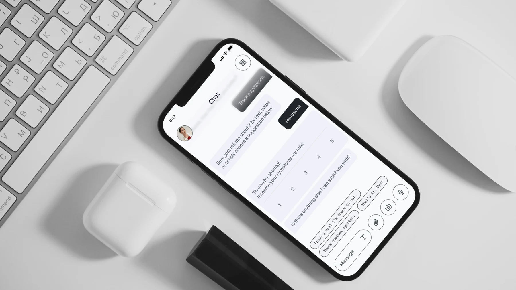
Focus on one phase, bring the tasks into one chat
We narrowed the concept to reintroducing foods. I designed the UI around one conversation for meals, symptoms and summaries, keeping the next action close to the relevant information instead of distributing it across separate screens.
Start with a photo. Confirm with words.
The prototype lets people photograph a meal, then confirm or correct ingredients through text or voice. Symptoms use a five-point severity scale. I designed structured inputs inside the chat so that natural conversation and precise entries work together.
Turn entries into something useful
The concept turns recorded information into shopping lists and shareable reports. These outputs give the documentation a practical purpose beyond collecting data. The prototype shows how a request in the chat becomes a document.
A design system for conversation and structured input
I created the design system and UI: reusable chat components, meal cards, symptom ratings, document previews and their states. Clear hierarchy and a consistent visual language connect free-form dialogue with guided actions.
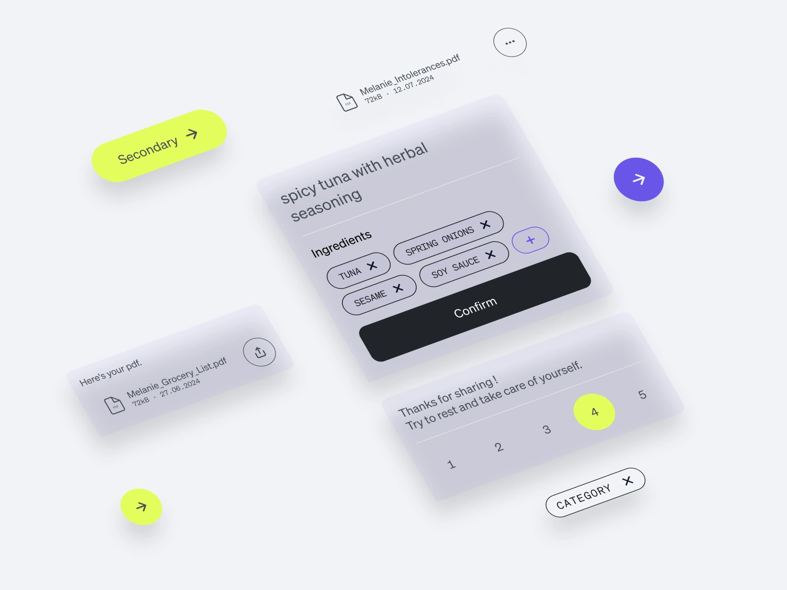
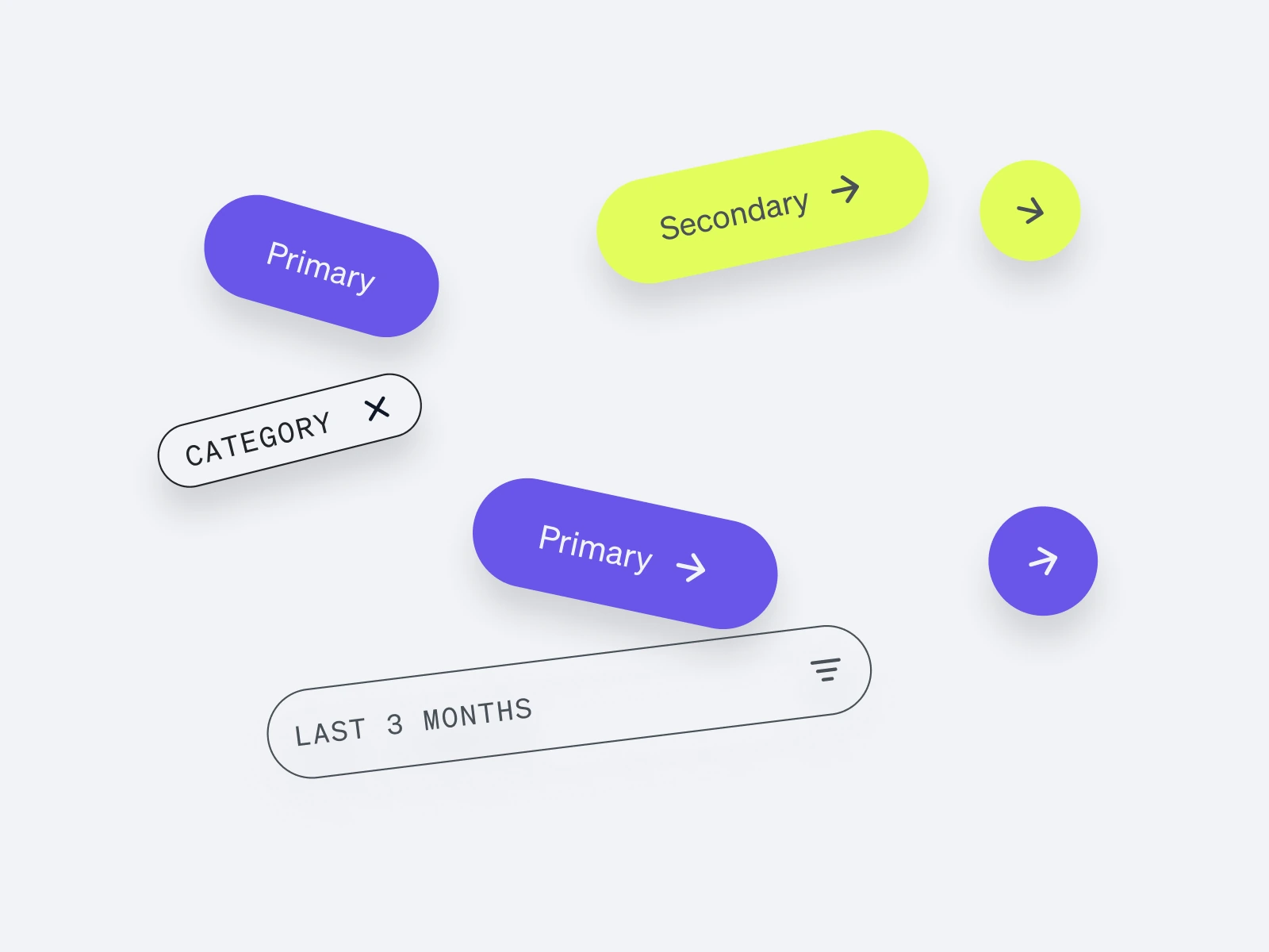
2 prototypes. A 40-day scenario. First generated reports.
We built a clickable high-fidelity prototype covering a fictional 40-day journey and a functional GPT prototype using SIGHI food lists. Test participants supplied data from which the GPT produced initial reports. Both prototypes were demonstrated at MediaNight. The 40 days describe the scenario, not the duration of a user study.
We did not measure time savings, retention or health outcomes. My next step would be to test meal entry and symptom logging with participants, measuring completion time, errors and whether they can sustain tracking over time.
Test the agent ↗